
Last Updated on
Lightroom is one of my all-time favorite programs to play around in – but I remember when I first downloaded Lightroom I thought to myself “this looks way too confusing, and it’s easier to just edit photos on my phone”.
Oh, was I ever wrong. I was initially scared off by Lightroom because of how intimidating it looks when you first open it. I mean, what’s a histogram? What’s a tone curve? I had no idea, but one day I decided to roll up my sleeves and figure out how to use Lightroom.
So today, I’m going to walk you through Lightroom with a tutorial for beginners, and get you up to speed so that you can:
- open Lightroom without freaking out and closing it (like I used to)
- begin to edit beautiful photos for your Instagram or website (or just for fun)
If you don’t have Lightroom, you can get both Lightroom and Photoshop for only $9.99/month.
Getting Started In Lightroom
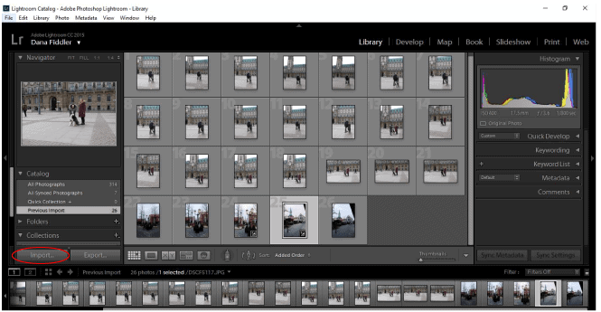
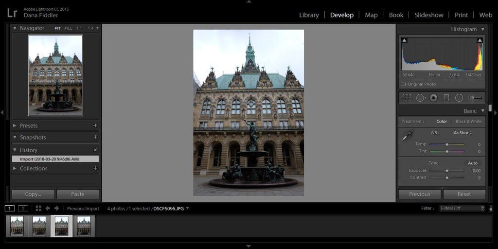
When you first open Lightroom, you’ll see something like this (although you may not have photos if you haven’t uploaded any yet).
In order to upload your photos, click import (bottom left).
Next, a screen will pop up where you will need to go and find your photos to upload.
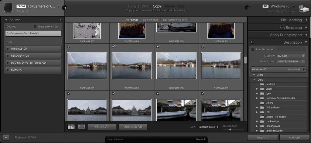
Check all the ones you’d like to import. Lightroom doesn’t make it easy to select a range of photos, so if you don’t want to click one-by-one, read how you can select a range of photos here.
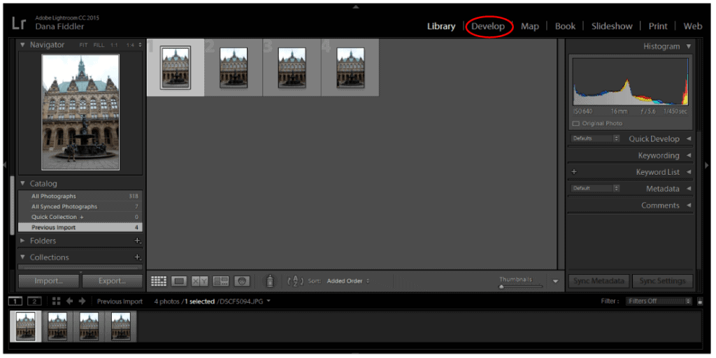
Once you’ve selected the photo(s) you’d like to edit, hit “import”. The photos you’ve imported will be shown in your library, and to begin editing them, you will need to click on “develop”, which will bring you to the workspace.
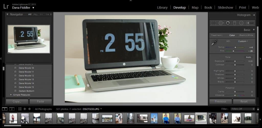
Let’s talk a little bit about what areas of Lightroom you will need to concern yourself with for simple (but powerful) editing.
This is what Lightroom will look like after you’ve gone into the development tab (hint: it basically looks the same as everything else).
First, you can see all your photos along the bottom. You can click on each of those photos to bring up a new one. Clicking on each photo isn’t going to cause your edits to disappear. Your edits will only disappear if you click the “reset” button on the far right. They won’t even disappear if you shut down Lightroom (no need hit “ctrl + S” every five minutes).
Along the left-hand side of Lightroom you have your presets, snapshots, history and collections. If you click on presets, you will find all the presets you’ve added into Lightroom.
Presets are a great way to introduce yourself to Lightroom. I started using presets first and making little adjustments as I learned more. So if you feel overwhelmed, I recommend grabbing my presets above and starting there!
Now back to our work area. In the middle, you will see the photo you are currently working on, and the right-hand panel is where all the editing will be happening.
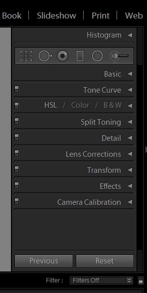
We are going to be focusing on a few different areas for our editing. I’m not a professional photographer so I don’t use all of these areas, but the ones I do use are able to really make a huge difference in my photos.
The first one we will focus on is the “Basic” editing. Next, we will touch on “Tone Curve”. After that, we’ll go into the “HSL / Color / B & W”. Lastly, we will use the “Detail” tab to sharpen up our image if we need to.
These are the areas I would recommend getting familiar with if you are brand new to Lightroom and plan to use it to edit photos for social media or your website. As you get more comfortable with it, you can move onto more advanced things!
Editing Photos In Lightroom: Basic Panel
First, click on the “Basic” tab to expand it.
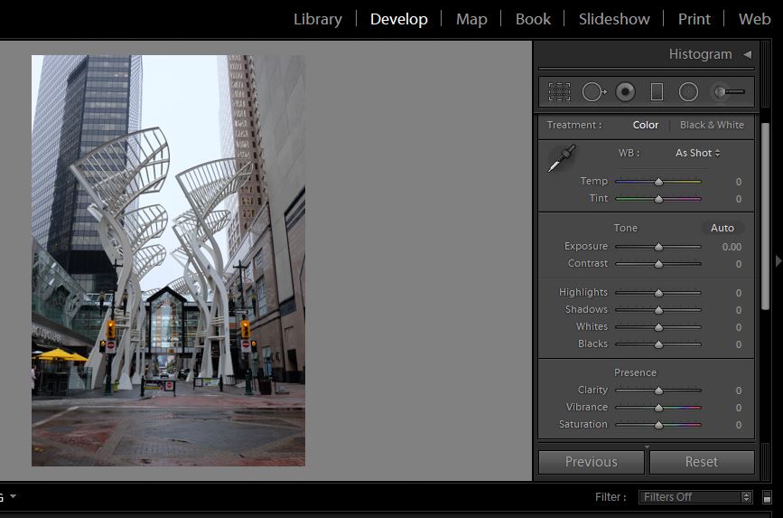
The temp is the temperature of the photo. At first, you might not notice anything temperature wise, but after editing lots of photos you will begin to notice that some have a blue-ish hue (like the one above) while some have a more warm feel to them. Using this slider can change your photo from warm to cool, or cool to warm.
Try moving the sliders around to see how they affect your photos! To reset any of the sliders, just double click on them and they will revert back to their original state.
Tint is pretty self explanatory – it tints your photo with either green or magenta.
How To Use Temp and Tint
Temp and tint can be really good for color correcting! Take this photo for example:
If you were to hold a white piece of paper next to it, you’d be able to see that there are a lot of magenta undertones in it!
If I want this to appear more white, I can add a tint to it of green. Why green? Well, green is the opposite of magenta, and adding some green in is going to neutralize the magenta. Alternatively, if this photo had green undertones we could tint it with magenta to cancel out the green.
Now the whites are more white. They still aren’t perfect (we can fix that later on) but adjusting the tint helped a lot! I also increased the temp slightly to make the photo look like there was a little sun coming through the window (which there was).
I’m happy with that, so let’s move down to the next section.
Adjusting the exposure is going to give your photo a brighter look. You really don’t want to be adjusting this too much, or you can distort the photo.
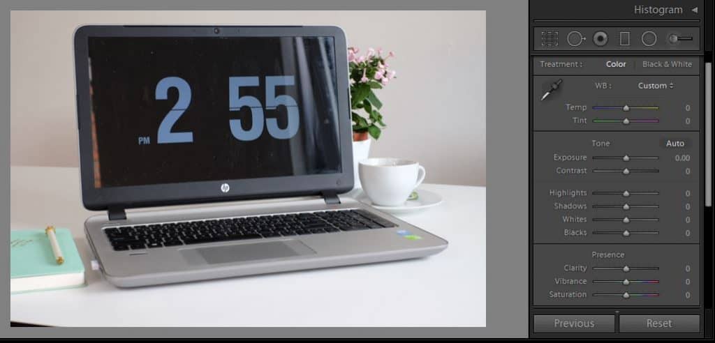
If you have a dark photo that you are trying to lighten up, you should first go into the shadows slider and increase that. Brightening up the shadows will help brighten photos without having to touch the exposure as much! Here is how I edited this photo:
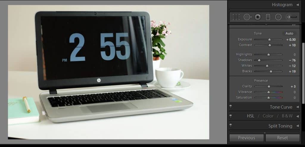
I first went in and adjusted the shadows. I actually darkened them so that the laptop screen looked darker. Next, I went to adjust the exposure and brightened it a tad. I personally like bright photos.
I also upped the contrast a little, turned the whites down and increased the blacks. These sliders will be different for every photo you edit!
I didn’t touch the highlights because the highlights are bright enough.
Lastly, I upped the clarity just a touch. Let’s discuss what each of these sliders will do to your photo, so you have an easier time understanding which ones you should use!
Exposure
Exposure will brighten your photo in its entirety.
Contrast
The contrast is the difference between white and black in your images. Increasing it will make your images more dynamic, whereas decreasing it will give a flatter look.
Highlights & Shadows
These sliders affect the highlights in your photo and the shadows. Increasing the shadows will brighten the image without having to adjust the exposure. As the exposure brightens the whole photo (including the highlights), the shadow slider allows you to get more precise by only brightening the areas that are dark. The highlights slider is the same, but with the highlights!
Whites & Blacks
The whites and blacks sliders target the lightest and darkest part of your photo. Here is a really simple and easy to follow tutorial that will help you understand how to use these sliders with more precision!
Clarity
The clarity slider can give the image more depth. I’m always very subtle with this slider, but try moving it around back and forth to see how it dramatically changes the look of your photo!
Vibrance & Saturation
Vibrance will intensify any muted colors in your photo, whereas saturation will affect the intensity of all the colors. This article explains visually the difference between vibrance and saturation. One of my favorite things to do is to slightly increase the vibrance, while slightly desaturating the saturation. This way, the colors won’t be so bright, but they won’t look washed out and grey (if you prefer softer photos).
Editing Photos In Lightroom: Tone Curve
The tone curve deserves a whole post to itself, but let’s go over the basics.
Essentially, the tone curve will adjust your highlights, lights, darks and shadows more precisely. For this particular photo, I didn’t want to adjust the highlights/lights anymore so I just pulled it down to give it some more depth.
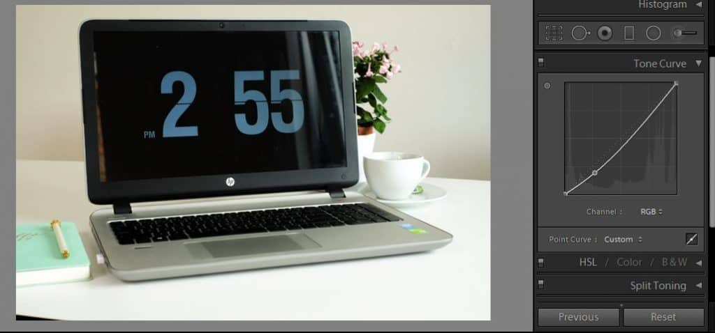
The best way to use the tone curve is just to experiment! Sometimes I don’t even use the tone curve, so if you are feeling like it’s too confusing, don’t worry too much about it!
One popular method with the tone curve is the “S-curve”. See how the tone curve is in the shape of an “S”?
For this photo, the light areas are too bright with the S-curve, so I won’t be using it this time and will be sticking with what I had originally up top!
Editing Photos In Lightroom: Color
Let’s head into the color pane next. This is where you get to pinpoint exactly how you’d like the colors to look in your photos.
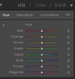
There are four different sections within HSL (which is what we are going to focus on). HSL stands for:
- hue
- saturation
- luminance
Hue changes the color. So as you can see in the screenshot above, we can make all the reds in the photo appear more orange by moving the slider to the right. We can make the blues seem more aqua by moving the slider to the left.
The saturation, as we discussed above, will affect the intensity. Drop the saturation down for a more washed-out color palette, or turn it up for more intensity!
Lastly, luminance affects how bright (or dark) each color is. If you want to make the greens appear brighter, you can increase the luminance. If you want the reds to be darker, you can decrease it.
I applied the following to the photo:
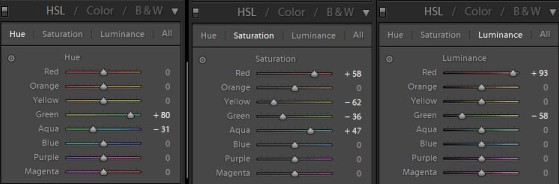
Now if you are feeling a little confused by now, don’t worry. This part can seem overwhelming and as you can see above, you won’t need to adjust every single color for every photo.
Usually what I do when it comes to this step, is I look for the color in the photo that is the most prominent and begin editing it. I’ll play around with the hue until I find something I like, and then I’ll move to the saturation, and then to the luminance.
Once I’ve completed one color, I’ll move onto the next. After doing this enough, you’ll eventually begin to see what colors you want to edit beforehand and it will make your process faster!
Editing Photos In Lightroom: Detail
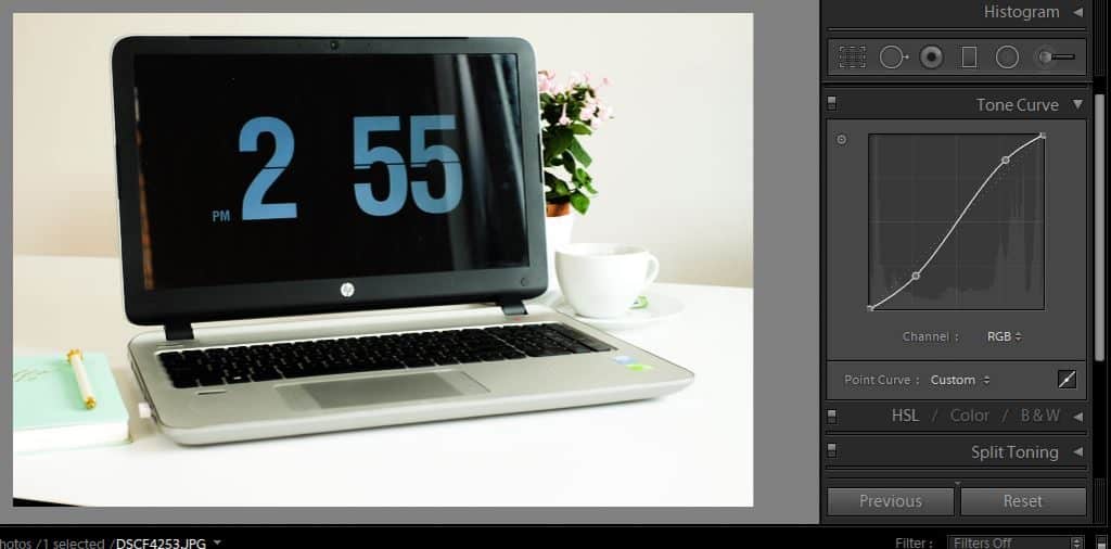
Lastly, I went into the “Detail” tab and sharpened the image a little. I also cropped it a little. You can access the crop function by hitting “r” which is the shortcut for crop. Once you have cropped your image to your liking, hit “enter”.
Pro tip: If you are wanting to toggle between the before and after of your photo to see how your edits are coming along, just press “\” (forward slash). After I was done, I went back in and made a few more adjustments in the basic panel until I was happy with the end result. Here you can see a before and after:
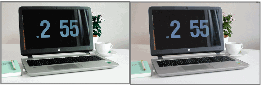
As you can see, the white walls and table are more “white” rather than pinky/purple. The blacks are darker, the leaves on the plant are a very deep green, and the pink flowers are bright and slightly desaturated. I also adjusted the color of the notebook slightly to make it more aqua.
I hope this will help your understanding of Lightroom! Remember, the best way to learn Lightroom is so sit down and play around with your images. Once you get comfortable with Lightroom, you might even want to make Lightroom presets to speed up your workflow!
Pin me:
This article may include affiliate links. As an Amazon Associate I earn from qualifying purchases.

Dana Nicole is an award-winning freelance writer for MarTech/SaaS who was rated one of the best SaaS writers by Software World. She specializes in writing engaging content that ranks high in search engines and has been featured in publications like Semrush, ConvertKit, and Hotjar.
Dana holds a Bachelor’s degree in Business Administration and has over 15 years of experience working alongside national brands in their marketing departments.
When Dana’s not working, you can find her dancing en pointe, cooking up new recipes, and exploring the great outdoors with her two big dogs.