
Last Updated on
Website accessibility is an important, and often forgotten about, part of being a business owner or blogger.
In today’s article, I’m going to introduce you to the concept of website accessibility and give you tips to help make your website more inclusive.
Disclaimer: This post is an intro to website accessibility and is not an exhaustive list. This article is also not meant to replace legal advice. If you’d like concrete advice on website accessibility, I recommend speaking to a lawyer who specializes in accessibility for the web within your jurisdiction.
What Is Website Accessibility?
Brick-and-mortar businesses, in most jurisdictions, are required to be accessible for everyone, regardless of any disabilities, restrictions or impairments the customer may temporarily or permanently face.
You might not know this, but your website should also be accessible as well, and in some countries, such as the United States, it’s a legal requirement under the Americans with Disabilities Act to have a website that is accessible for everybody, despite any impairments they may have.
Your website must be accessible and prevent no barriers to entry regardless of someone’s:
- socio-economic restrictions
- physical disabilities
- situational disabilities
In fact, in the United States, website accessibility lawsuits are increasing as more and more people create websites that aren’t inclusive.
To give you a brief introduction into website accessibility, let’s review some simple examples of how a website might not be accessible:
- The contract between the color of your font and your website’s background color is not high enough and it’s difficult to read for someone with color blindness
- Your font size is too small and it’s difficult to read for someone who doesn’t have 20/20 vision
- Your videos don’t have captions and it’s impossible for someone who hard of hearing to understand the content of the video
- Someone is viewing your website from a slow internet connection and the images aren’t able to load, therefore, they aren’t able to see screenshots or images throughout your content
The above are just a few examples of how you may be unintentionally alienating specific users.
The tips within this blog post are a good starting point, but I still recommend you do your own research into the specific requirements that your country has set in place.
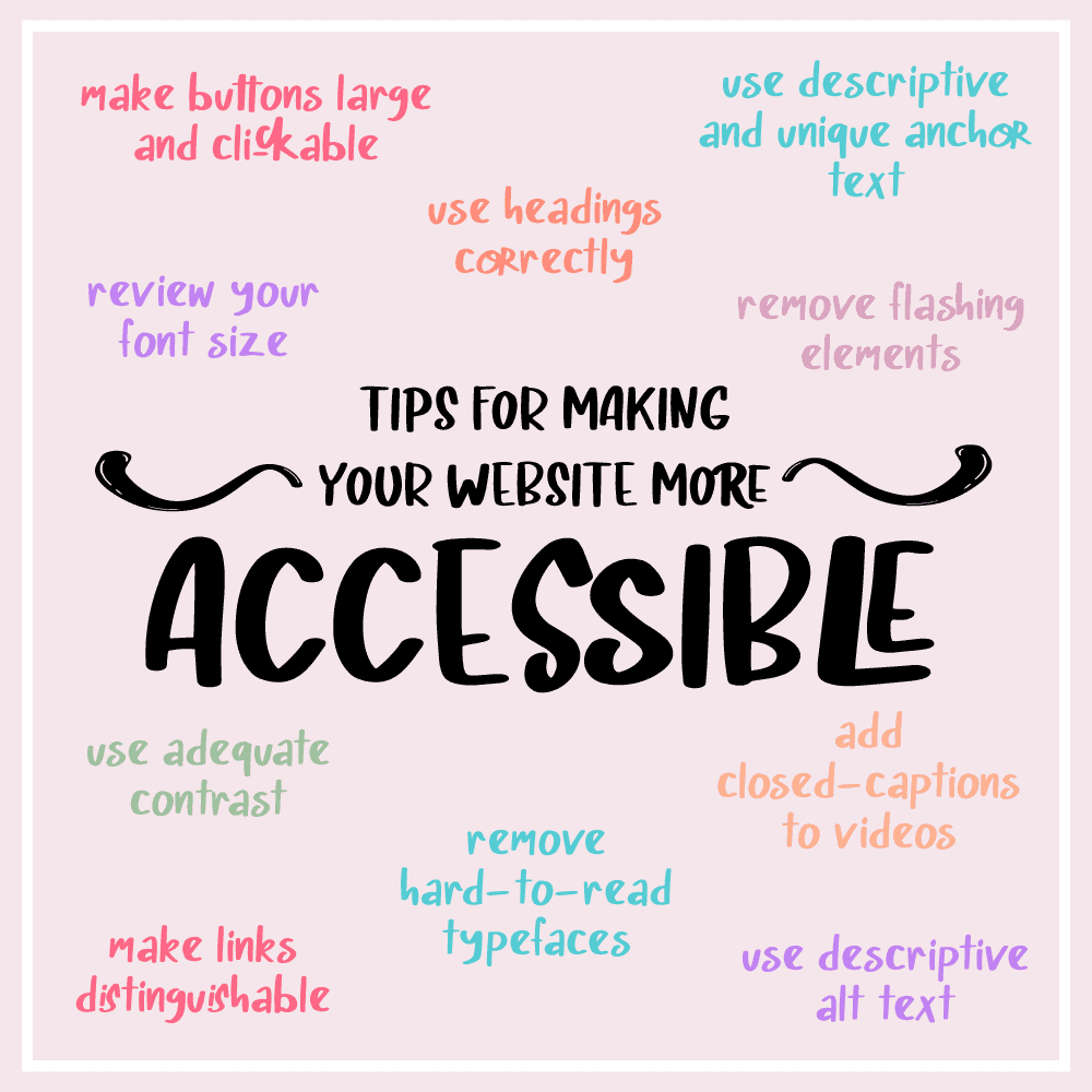
Let’s discuss some simple ways you can immediately improve your website accessibility.
Website Accessibility Tips
You’ll be able to employ the tips in this article promptly so your website provides a better experience for your readers.
1. Review Your Font Size
Small font sizes can be quite difficult to read. To you, the font size may be a fine size, however, for someone who has trouble seeing small letters, a tiny font choice means they may not be able to read the content within your website.
While small text can often look chic, it’s a pain to read.
2. Have Adequate Contrast
Websites with high contrast elements can be helpful for those who have visual impairments.
An example of this is someone who is color blind.
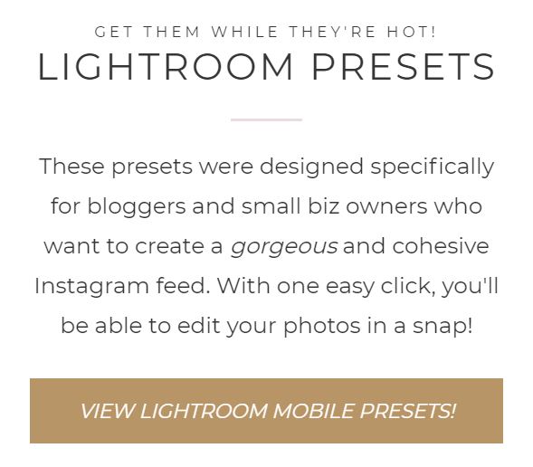
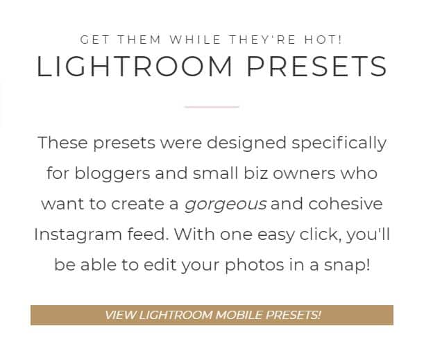
To someone who has sharp vision, light pink text on a white background might be easy to read.
But for someone who has colorblindness, they may not be able to read the text with ease.
Let’s take a look at this through the example below:

The text above is difficult for many people to read. The solution? Darken it.
Toptal has a wonderful colorblind webpage filter that demonstrates how your site looks to someone with colorblindness.
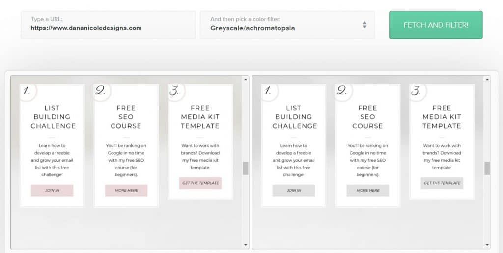
There are three different color filter lenses you can view your site from.
Give it a try! If particular elements of your site blur together, consider adding more contrast so the elements stand out.
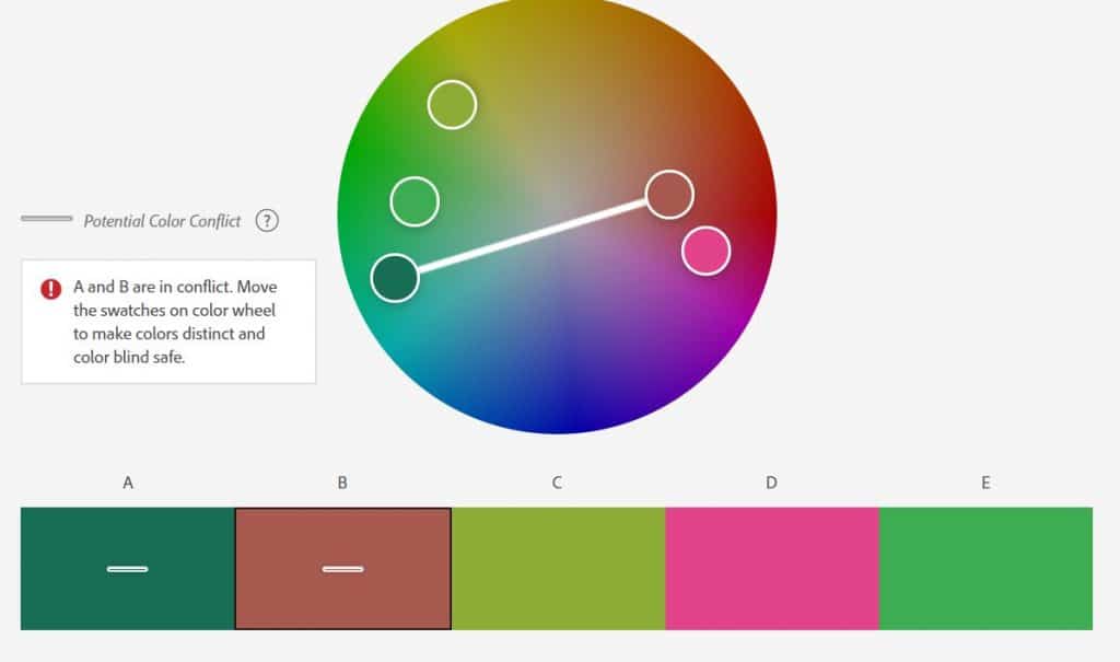
Adobe’s Color Wheel is another tool you should use before you choose brand colors to see whether or not they are suitable to use together.
When you input your colors, it will let you know whether or not they are color blind safe.
3. Use Descriptive Alt Text for All Photos
Alt text has widely been abused over the years, specifically by bloggers who use Pinterest marketing and put their pin descriptions where the alt text should go.
This misinformation has been spread by irresponsible “gurus” over the years and not only is it incorrect but it is also harmful to people who use screen readers.
The purpose of alt text is to describe the image for a couple of different purposes:
- If someone is viewing your website on a slower internet connection and your images don’t load, the alt text will show in place of the image so the reader is able to understand what the image should be
- If someone with a visual impairment uses a screen reader read your content to them, the screen reader will read the alt text so they are able to imagine the image themselves
- If you accidentally delete the image or the image file path breaks, the alt text will show so your readers can still understand what the image should be
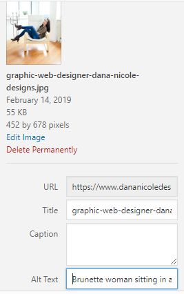
Let’s take a look at this image:

For alt text, you want to explain the image as concisely as possible. I’ve written the following for the alt text:
Pink flowers beside a laptop and cup of coffee on a desk.
Adding descriptive alt text is necessary for your website to be accessible to a wide audience.
Here’s what alt text is not for:
- Pin descriptions
- Stuffing keywords so your images rank in Google
- Adding hashtags
- Adding anything that doesn’t describe the image
If you’re struggling with alt text, remember that it’s not supposed to be complicated. A simple description is all you need to help your reader understand what the image is. End your alt text with a period “.” so the screen reader knows to come to a full stop when reading aloud.
And if you are wondering what you can do with your Pinterest descriptions, I’ve written a lengthy article about alt text and Pinterest on Tailwind’s blog that dives deeper into the topic and provides you with two alternative ways to properly incorporate Pinterest descriptions while using alt text appropriately.
If alt text isn’t something you’ve known about or thought of before, you will need to go back and write proper alt text for each photo on your website.
4. Remove Typefaces that Are Difficult to Read
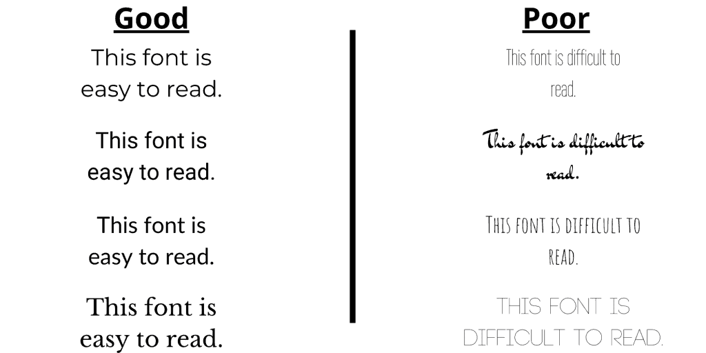
Let’s take a look at the below image.
This image features two different types of content. On the left-hand side, there is a text in an easy-to-read typeface and the right side features poor readability.
It’s important to be mindful of your font choices. Typefaces that are too light, narrow or decorative can be incredibly challenging to read, even for someone with 20/20 vision.
There are many great typefaces that are crisp and clear. A few of my favorites are:
- Verdana
- Open Sans
- Montserrat
- Lato
- Roboto
- Georgia
5. Make Buttons Large and Clickable
Small buttons are difficult to click, and someone who has trouble with precise movements could have difficulty clicking buttons if they are small.
Below is an example of a section on my website with a large button that is easy for users to select:
Now, let’s take a look at a button that is small with less padding, requiring more precision on behalf of the user to click:
When your buttons are easy to click, all of your users will have a simpler time navigating through your website.
6. Use Headings Correctly and Format Text Properly (Semantic Structure)
Headings guide a user through your copy and help them navigate through to specific sections.
HTML uses six different headings: H1 (this is always reserved for the title in WordPress and will never be used in the body of your content), H2, H3, H4, H5 and H6.
Headings must appear in chronological order.
For example, an H3 heading can never be placed directly under an H1 (title) but can be placed under an H2 heading. like so:
<h1>This is your title<h1>
  <h2>Here is a main heading</h2>
    <h3>Here is a sub heading under our H2 heading</h3>
      <h4>Here's a sub heading for our H3 section</h4>
        <h5>Here's a sub heading for our H4 section</h5>
          <h6>Here's a sub heading for our H5 section</h6>
Semantic structure allows users to efficiently scan and navigate through your content.
7. Create Tables Only for Simple Tabular Data
Tables can be fantastic for displaying data, but for someone using a screen reader, they can be a nightmare if they aren’t used correctly.
If you have a table you want to share with your audience, make sure you are also describing the table so they can still get the information without needing to visually see it.
And try to keep your tables as simple as possible.
8. Add Closed Captions to Video Content
For someone who may not be able to hear your videos, adding closed captions means they can still enjoy your video content without losing any important information through the sound.
Here are some free closed caption tools to help you get started.
Pro tip: many users also watch Instagram Stories with the sound off or cannot hear them to begin with. Adding captions or text to accompany your stories will help you be more inclusive on social media as well.
9. Use Descriptive and Unique Anchor Text
Anchor text, also known as clickable link text, helps users identify links within your content.
Screen readers often will display links from an article alphabetically so the user can easily hear the links being read to them.
If that list reads to the user as “click here”, “here”, “click here now” it’s not very helpful and doesn’t give them an understanding of where the link is taking them.
Your anchor text should be descriptive and identify where the user will be going if they choose to click the link.
Secondly, users can “click” links through their voices by saying “click [insert anchor text here]”.
If your anchor text is vague and duplicated throughout your content (for example, if you’ve used “click here” multiple times), a screen reader isn’t going to know which link the user is wanting to click on.
Using unique descriptive anchor text will help your readers navigate through your links.
10. Make Links Distinguishable From Non-Hyperlinked Content
On the topic of links, links should pop out to the user and be easily identifiable as a link.
In most cases, your links are probably already different (i.e. they are a different color, they are underlined or bold, etc).
If they aren’t, this is your reminder to make sure they are easy to spot within your content.
11. Remove Flashing Elements
Seizures are often triggered by flashing elements and should not be shown to users without some kind of warning at the bare minimum.
It’s best to remove flashing elements altogether, to avoid potentially triggering a seizure.
12. Ensure Keyboard Accessibility
For people who don’t have access to a mouse or cannot use a mouse, your website should also be accessible through the keyboard.
To see if your website is keyboard accessible, try pressing the “tab” key to move through your content.
Through the tab button, you should be able to move through the navigation and links within the content.
13. Consolidate Form Input Elements
If you have forms on your website (such as a contact form) try to consolidate the input areas as much as possible and remove any information that isn’t vital.
For example, a contact form that has three input spaces for a first name, last name and company could be changed to only include one input space for a full name and omit the company name (unless it’s something you really need).
You want to ensure filling out forms can be done as easily as possible. Forms with extraneous input options can be tedious and difficult for some to complete.
Website Accessibility Plugins
WordPress’s One Click Accessibility plugin is my favorite plugin for website accessibility.
This plugin will add a floating icon to the side of your page like so:
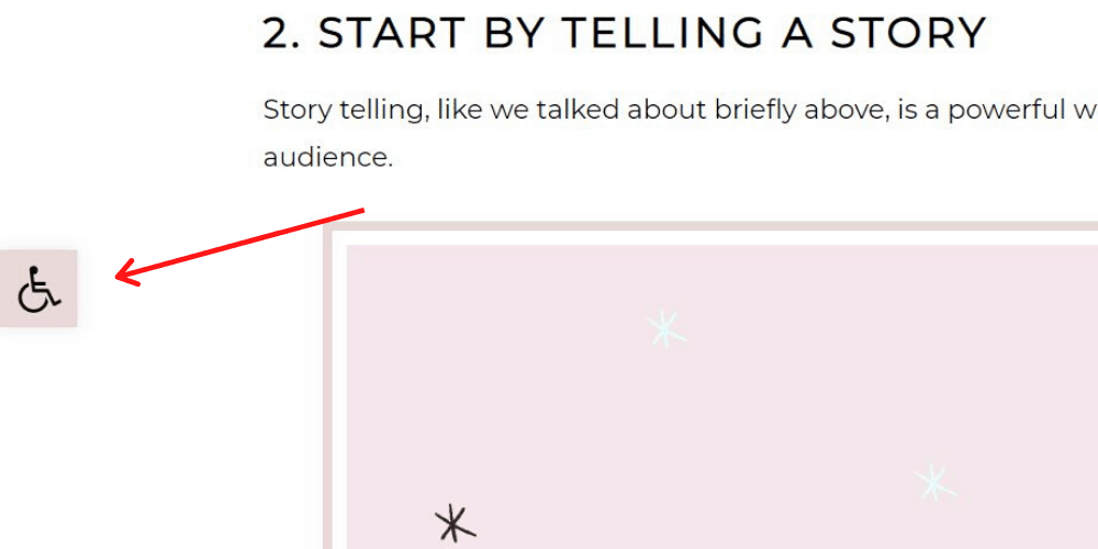
Clicking on that icon will open a menu of options that will allow the user to instantly customize your website for the duration of their visit:
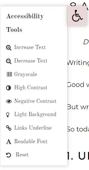
Readers can easily:
- Increase or decrease text size
- Grayscale your website
- Increase the contrast
- Add negative contract
- Turn on a light background
- Underline the links
- Change the font so it’s easier to read
Options can be used together or separately so the reader can be as precise as possible with their needs!
The plugin requires minimal set up and once activated will be ready to go.
Your Next Steps
If you are ready to make sure your website is as accessible as possible, I recommend installing the above plugin and going through the tips to improve your website’s accessibility.
Remember: these tips are just a starting point and I am not a specialist in website accessibility. But going through and checking off these points will make your website a lot more inclusive.
To find out more about website accessibility, you can read through these Web Content Accessibility Guidelines.
Have I missed anything? Feel free to reach out to me if there’s any tips you think would be beneficial to include!
Pin me:
This article may include affiliate links. As an Amazon Associate I earn from qualifying purchases.

Dana Nicole is an award-winning freelance writer for MarTech/SaaS who was rated one of the best SaaS writers by Software World. She specializes in writing engaging content that ranks high in search engines and has been featured in publications like Semrush, ConvertKit, and Hotjar.
Dana holds a Bachelor’s degree in Business Administration and has over 15 years of experience working alongside national brands in their marketing departments.
When Dana’s not working, you can find her dancing en pointe, cooking up new recipes, and exploring the great outdoors with her two big dogs.